👆 用户界面:别让人猜👆 User Interface: Don't Make People Guess
上一片,小卖部点餐页排得清清爽爽。可一试用,问题全来了:有人点错,有人干等,有人找不到下一步。好看不等于好用。这一片讲用户界面。Last leaf, the snack stand's ordering page got a clean, tidy design. But the first test run went badly: some classmates tapped the wrong thing, some waited on buttons that did nothing, some couldn't find the next step. Looking good isn't the same as being easy to use. This leaf is about user interfaces.
第 1 步:按钮要像按钮Step 1: Buttons should look like buttons
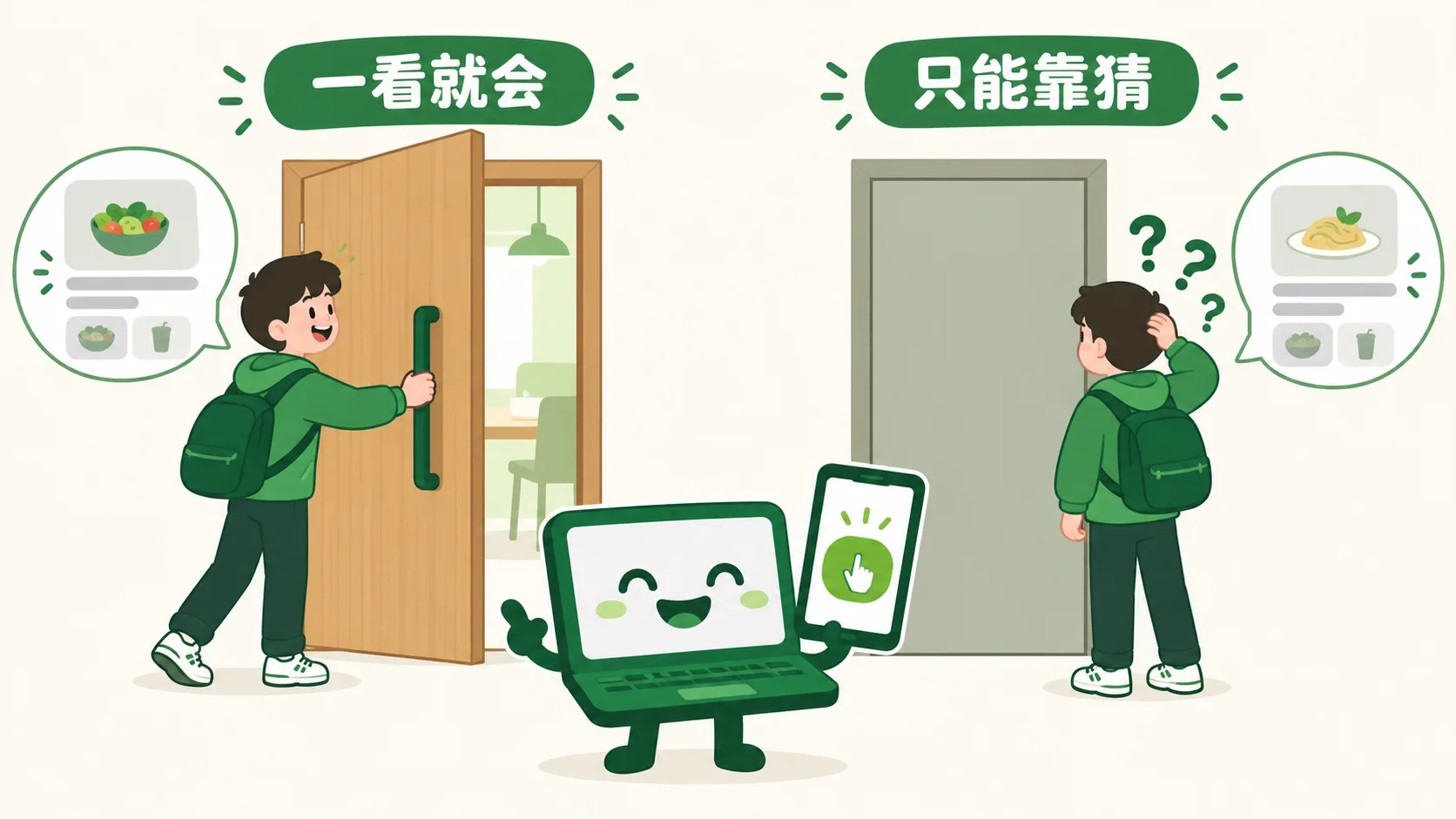
什么叫“好用”?先看两扇门。What makes something easy to use? Start with two doors.
用户界面,就是人和程序打交道的那一面:按钮、输入框、图标、提示。好界面像门把手:不用说明书,一看就知道怎么用。所以按钮要有按钮样:有颜色、有边框,像能按下去。灰扑扑的平字,大家以为点不了。光秃秃的图标,最好配上字。A user interface is the side of a program that people deal with: buttons, input boxes, icons, messages. A good one works like a door handle — no manual needed, you just know what to do. So buttons should look pressable: color, edges, a raised feel. Flat gray text looks untappable, and a bare icon works better with a label.
按钮认出来了。可点下去,屏幕纹丝不动——到底点上没有?Now people can spot the button. But they tap it and the screen doesn't move — did it work?
第 2 步:点了要有反馈Step 2: Every tap gets an answer
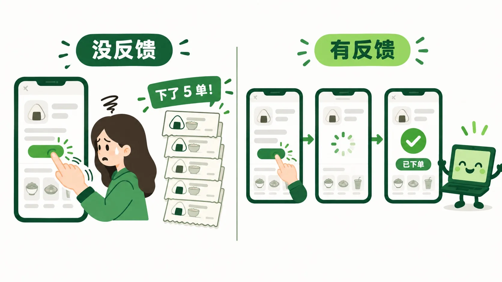
没反馈的界面最让人心慌:点了没动静,只好再点。结果一口气下了 5 单饭团!好界面每一步都回话:按下时变色,等待时转圈,成功了打勾。哪怕网速慢,也要告诉人:“我在忙,别急。”A silent interface makes people nervous: no response, so they tap again — and suddenly there are 5 rice-ball orders! A good interface answers every move: the button changes color when pressed, a spinner turns while waiting, a check mark appears on success. Even on a slow network, it should say: “Working on it — hang on.”
能点、有回应了。最后:点餐要走好几步,怎么不让人迷路?Tappable and answering back. Last question: ordering takes several steps — how do people not get lost?
第 3 步:别让人猜下一步Step 3: Never make people guess what's next
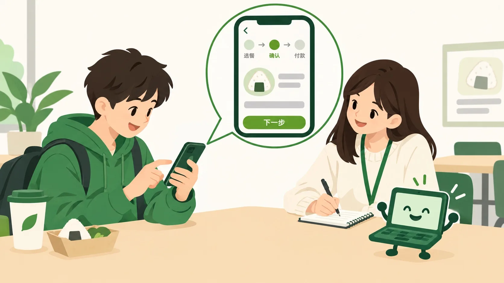
流程要像路标:顶上写着第几步,一共几步。每屏只有一个主按钮,写清要干啥,比如「下一步」。点错了能返回,删东西前先确认。真正的设计师还会请同学试用,看哪儿卡住,再接着改。这叫可用性测试。A flow should work like road signs: show which step you're on and how many there are. Each screen gets one main button that says exactly what it does, like “Next”. Mistakes can be undone with Back, and deleting asks first. Real designers also watch classmates try it, note where they get stuck, and fix it. That's called usability testing.
🎮 你来当试用员(30 秒)🎮 Your turn: be the tester (30 seconds)
道理讲完了。下面是点餐页的试用版,藏着 4 处让人困惑的设计。点一点、试一试,把它们全找出来。Theory done. Below is a trial version of the ordering page with 4 confusing spots hidden in it. Tap around, try things, and find them all.
一句话记住它:好界面像门把手——不用说明书,一看就会用:按钮像按钮,点了有回应,下一步写清楚。Remember it in one line: a good interface is like a door handle — no manual needed: buttons look pressable, every tap gets an answer, and the next step is spelled out.
看得懂:按钮像按钮,图标配上字Readable: buttons look pressable, icons come with labels有回应:按下变色、等待转圈、成功打勾Answers back: color on press, spinner while waiting, check on success不迷路:标明步数、一个主按钮、能返回、删前确认Never lost: show the steps, one main button, Back works, confirm before deleting
内容参考 OpenStax 等公开教材,多来源核对 · AI 生成、人工审核 · 发现错误欢迎指正,帮这片叶子长得更好。Based on OpenStax and other open textbooks, cross-checked across sources · AI-generated, human-reviewed · Spotted a mistake? Tell us — help this leaf grow.
 Back to tree