🎨 网页设计:一眼看懂的页面🎨 Web Design: A Page You Get at a Glance
软件开发细枝讲完了:写代码、测代码、团队一起干。从这片起,进入新细枝「数字创造」。💻小电脑要给校园小卖部做点餐网页。可初稿乱成一锅粥,谁也看不懂。这一片学网页设计。The Software Development twig is done: write code, test it, build it as a team. Now a new twig begins: Digital Creation. 💻 Little Computer is building an ordering page for the campus snack stand — but draft one is a total mess. This leaf is about web design.
第 1 步:布局——先分区,再摆放Step 1: Layout — zones first, then placement
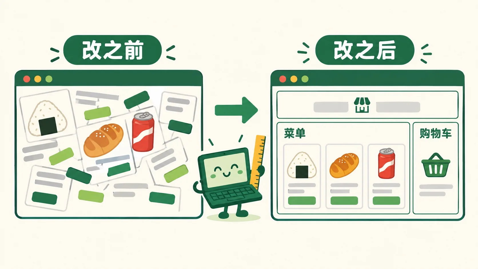
初稿到底乱在哪?先和改好版比一比。So what's wrong with draft one? Compare it with the fixed version.
初稿啥都堆在一起:图片、价格、按钮东倒西歪。网页设计第一步叫布局:先把页面切成几块区域。顶部放店名,中间放菜单,旁边放购物车。同类东西放一起,眼睛就不迷路。就像收拾书桌:抽屉分好类,找东西才快。Draft one dumps everything together: pictures, prices and buttons tumble everywhere. Step one of web design is layout: cut the page into zones. The shop name goes on top, the menu in the middle, the cart at the side. Put like with like, and eyes never get lost — just like a desk where sorted drawers make things quick to find.
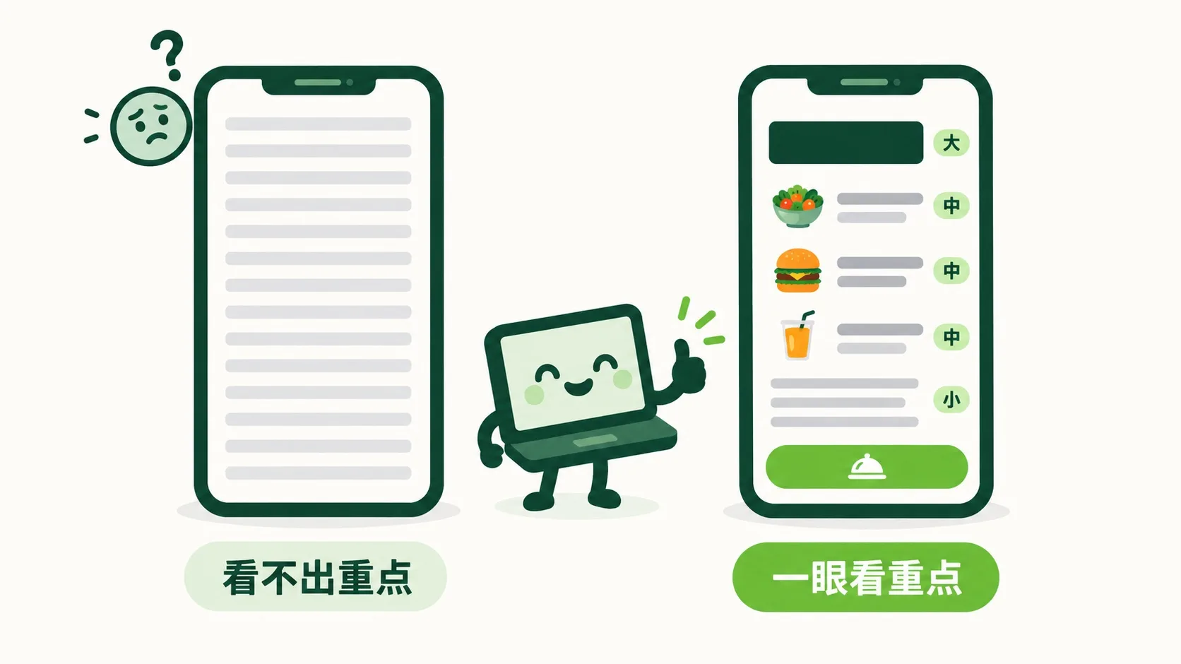
区域分好了。可满屏字一样大,还是不知道先看哪。The zones are set. But with every word the same size, where do eyes go first?
第 2 步:字号分层级,颜色别贪多Step 2: Size in levels, color in moderation
字号要分层级:店名最大,菜名中等,说明最小。眼睛总是先看大的,再看小的。配色别贪多:一个主色,加一个强调色就够。最要紧的按钮用强调色,比如绿色的「下单」。字和背景要对比够强:浅灰字配白底,谁也看不清。Text sizes come in levels: shop name biggest, dish names medium, notes smallest. Eyes always land on big things first, then small ones. Go easy on color: one main color plus one accent is plenty. Give the accent to the most important button — like a green Order button. Text needs strong contrast with its background: pale gray on white is hard for anyone to read.
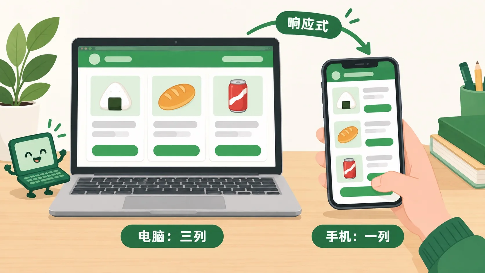
电脑上看挺好。可同学们多用手机点餐,屏幕窄了一大半,怎么办?Looks good on a laptop. But most classmates order on phones — a screen less than half as wide. Now what?
第 3 步:响应式——手机上也要好用Step 3: Responsive — it must work on phones too
网页不知道你用啥屏幕,所以它得会“变形”。宽屏时,菜单排三列;到了手机上,自动叠成一列,往下滑着看。这叫响应式设计。屏幕变窄,字不能缩小,按钮要大到手指好点。如今一大半上网,都是用手机。A webpage never knows what screen it will land on, so it has to reshape itself. On a wide screen the menu sits in three columns; on a phone it stacks into one, and you scroll down. That's called responsive design. As the screen narrows, text shouldn't shrink, and buttons must stay big enough for a thumb. Today, more than half of all web browsing happens on phones.
🎮 你来改版(30 秒)🎮 Your turn: the makeover (30 seconds)
道理讲完了。下面是小卖部初稿的实时预览。过 4 关:每关挑一种改法,预览马上变。Theory done. Below is a live preview of the snack stand's draft. Clear 4 rounds: pick a fix each time and watch the preview change.
一句话记住它:网页设计 = 让人一眼看懂。先分区布局,再用字号和颜色排出主次,最后保证手机上也好用。Remember it in one line: web design means a page you get at a glance — lay it out in zones, rank things with size and color, and make sure it works on phones.
布局:先分区,同类东西放一起Layout: zones first, like things together层级:大字先看;一个强调色,留给最重要的按钮Hierarchy: big text first; one accent color for the key button响应式:手机上叠成一列,字不缩、按钮够大Responsive: one column on phones, readable text, tappable buttons
内容参考 OpenStax 等公开教材,多来源核对 · AI 生成、人工审核 · 发现错误欢迎指正,帮这片叶子长得更好。Based on OpenStax and other open textbooks, cross-checked across sources · AI-generated, human-reviewed · Spotted a mistake? Tell us — help this leaf grow.
 Back to tree