📊 统计图表:让数据开口说话📊 Statistical Charts: let the data speak
上一片里,方差和标准差给数据的“波动”量出了尺寸。但一串数字太冷静了——想让大家一眼看懂,还得请出三位数据画家。Last leaf, variance and standard deviation put a number on the “spread” of data. But a string of numbers stays cold — to let everyone see it at a glance, call in the three data painters.
第 1 步:三位数据画家Step 1: the three data painters
先认识三位画家——它们看同一组数据,角度完全不同。Meet the three painters — they look at the same data from completely different angles.
柱状图用高矮比大小,谁多谁少一目了然;折线图用起伏看趋势,升高下跌一眼就知道;饼图用扇形看占比,谁占多大一块心里有数。选图就像选工具:拧螺丝用螺丝刀,敲钉子用锤子。A bar chart compares sizes with height — who has more is plain to see. A line chart shows trends with its ups and downs — rises and falls at a glance. A pie chart shows shares with slices — how big each piece is, right in front of you. Picking a chart is like picking a tool: a screwdriver for screws, a hammer for nails.
那随便挑一种画,不行吗?So can we just pick any chart?
第 2 步:选错画法,数据会“说谎”Step 2: a wrong chart lets data “lie”
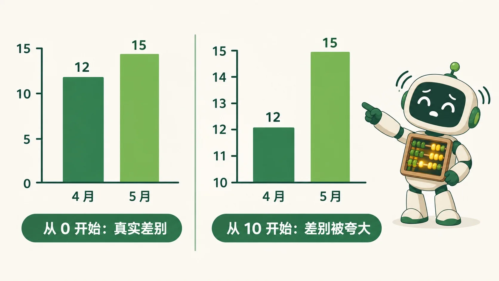
同一组数据(4 月 12 件、5 月 15 件):左边纵轴从 0 开始,两根柱子差不多高——这是真实差别;右边纵轴从 10 开始,一根矮、一根高出一大截,差别被放大了好几倍。图没画错,但眼睛被骗了——画柱状图,纵轴要从 0 开始。Same data (April: 12, May: 15). On the left the y-axis starts at 0: the two bars look almost equal — that is the true difference. On the right the y-axis starts at 10: one bar looks tiny and the other towers over it — the gap is blown up several times. The chart isn’t drawn wrong, but your eyes are tricked — so when you draw bars, start the axis at 0.
真实工作里,人们也是这样挑图的吗?In real work, do people pick charts this way too?
第 3 步:真实世界的数据看板Step 3: dashboards in the real world
一块看板上,每张图只回答一个问题:昨天卖了多少(数字卡)、这周卖得怎么样(柱状图)、这个月走势如何(折线图)、顾客从哪来(饼图)。数据一多,先问清楚“我要回答什么问题”,再挑图——是问题决定图,不是图决定问题。On one dashboard, every chart answers just one question: how much did we sell yesterday (the number card), how did this week go (bar chart), how is the month trending (line chart), where do customers come from (pie chart). When data piles up, first ask “what question am I answering”, then pick the chart — the question chooses the chart, not the other way round.
🎮 你来当数据师傅(1 分钟)🎮 Your turn: chart master (1 minute)
道理讲完了。先给每组数据挑对图表,再读图答题,一共 4 关——最后一关藏着“纵轴陷阱”。Theory done. For each set of data, first pick the right chart, then read it to answer — 4 rounds, and the last one hides a “y-axis trap”.
一句话记住它:柱状图比大小、折线图看趋势、饼图看占比;画柱状图,纵轴一定要从 0 开始。Remember it in one line: bars compare sizes, lines show trends, pies show shares — and for bar charts, always start the axis at 0.
比大小用柱状图、看趋势用折线图、看占比用饼图Bars for sizes, lines for trends, pies for shares柱状图纵轴从 0 开始才诚实;从中间开始会把小差别画成大差别A bar chart is honest only when the axis starts at 0; starting midway blows small gaps out of proportion先想清楚“要回答什么问题”,再决定画哪种图First ask “what question am I answering”, then choose the chart
内容参考 OpenStax 等公开教材,多来源核对 · AI 生成、人工审核 · 发现错误欢迎指正,帮这片叶子长得更好。Based on OpenStax and other open textbooks, cross-checked across sources · AI-generated, human-reviewed · Spotted a mistake? Tell us — help this leaf grow.
 Back to tree